Testifi: COVID-Free Hangouts.
How we designed a socially unintrusive COVID-19 status verification platform in 48 hours
Platforms
iOS
Deliverables
Figma Prototype
Timeline
2 days
*Disclaimer: At the time of the completion of this project, the COVID Delta variant was just emerging. Much of the information available to us now was unknown to us or has evolved since May 2021.
Overview
BACKGROUND − In April 2021, right when the first COVID vaccines were just rolling out, my team and I were tasked with designing a social solution within 48 hours that addressed a problem “in our post-COVID world” by UX FEST SLO. Our first instinct was to look towards humanity’s biggest fears related to COVID — COVID itself:
With much of the country planning to transition to in-person interactions, we were all familiar with that nagging feeling… were all our friends really COVID-free? Could we fully trust that they were all vaccinated and testing regularly? Could we ensure the safety of our immunocompromised loved ones?
TIMELINE - We allocated Day 1 for research and product strategy and Day 2 for interface design and prototyping.
We each had our strengths, with Hannah taking point on the design system, Van immersed in graphic design, and Devanshi specializing in product strategy.
MY ROLE - As I was the most well-versed with Designathons, I crafted much of our game plan and extended my efforts primarily to information architecture, interface design, and prototyping.
CONFLICT
Individuals continue to socialize even though the country is far from hitting vaccination goals.
Mask rates have dropped by over 20%, yet over half the American population remains unvaccinated due to widespread vaccine myths, logistical obstacles, and partisan divide.
OPPORTUNITY
What if individuals were to gain access to a digital verification database listing when their friends were last vaccinated or tested?
We could transcend problems of dishonesty and thereby socialize more safely without fear of spreading COVID.
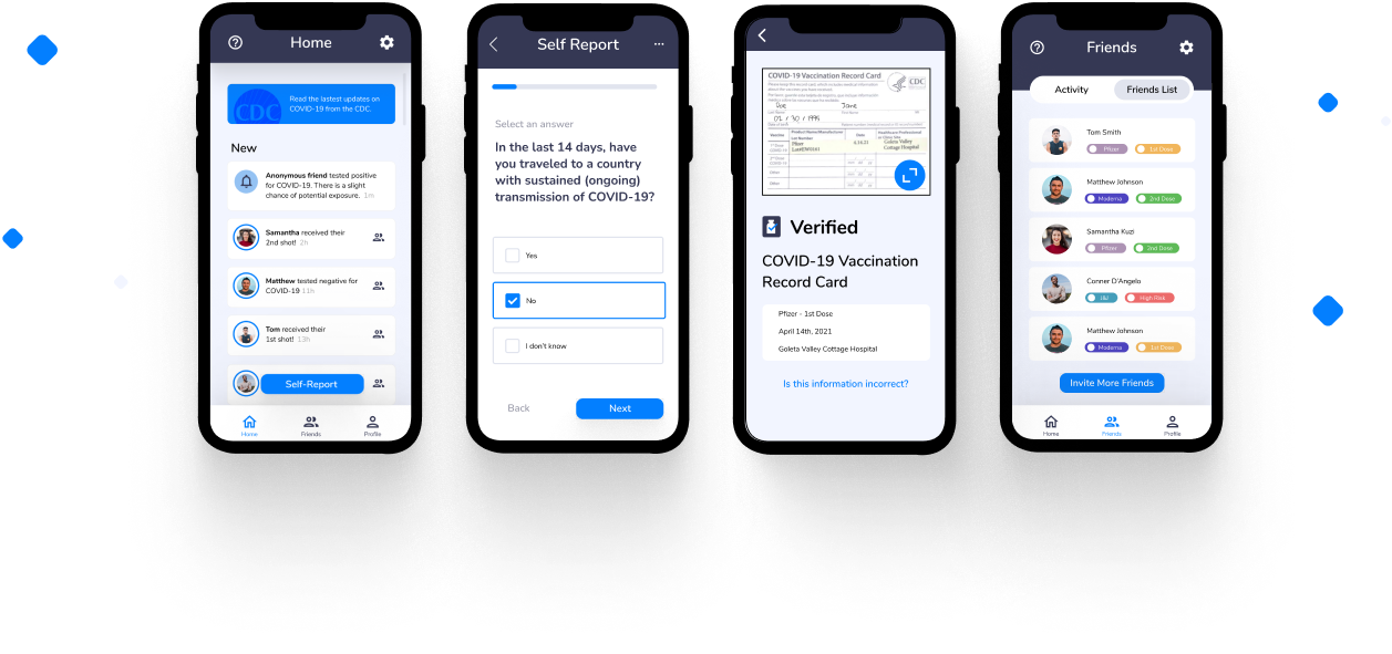
SOLUTION PREVIEW
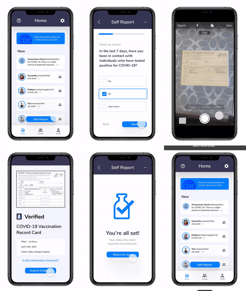
Submitting a self report for your first COVID vaccine
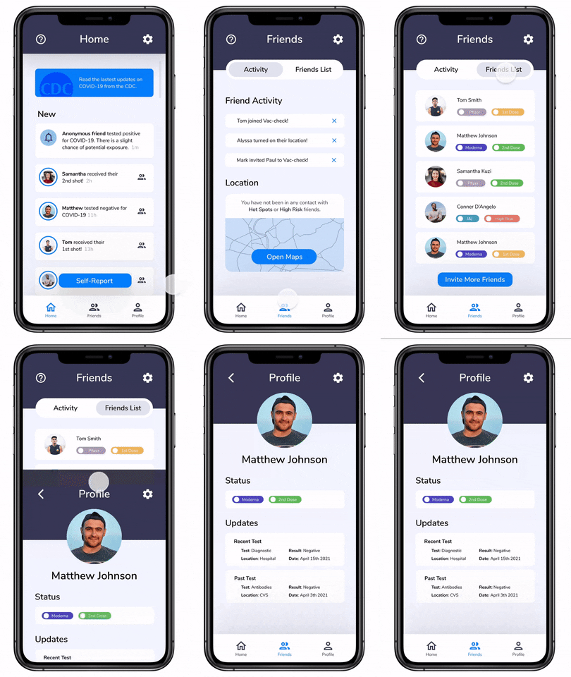
Checking your friend “Matthew’s” COVID health status
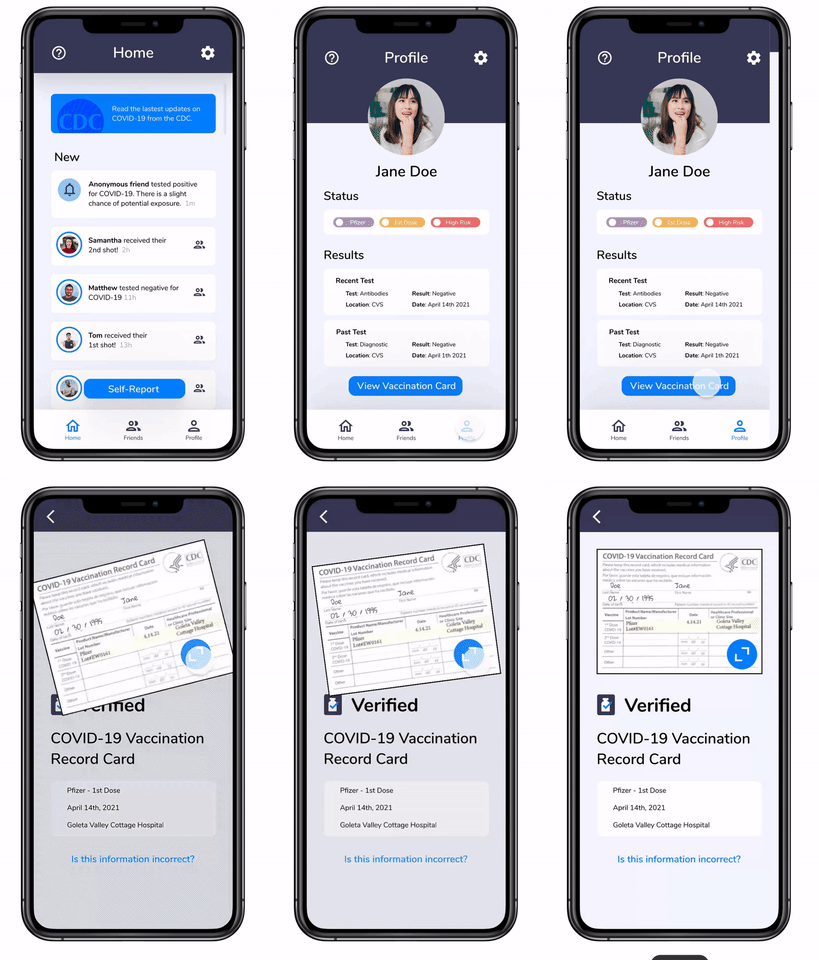
Accessing your vaccine card
Results
We won! Out of 30 teams across several universities, we placed 1st. Our team presented to a panel of professionals from Lyft, Docusign, Workday and professors from Cal Poly SLO where they awarded us the grand prize. Check out our pitch below
Redesign
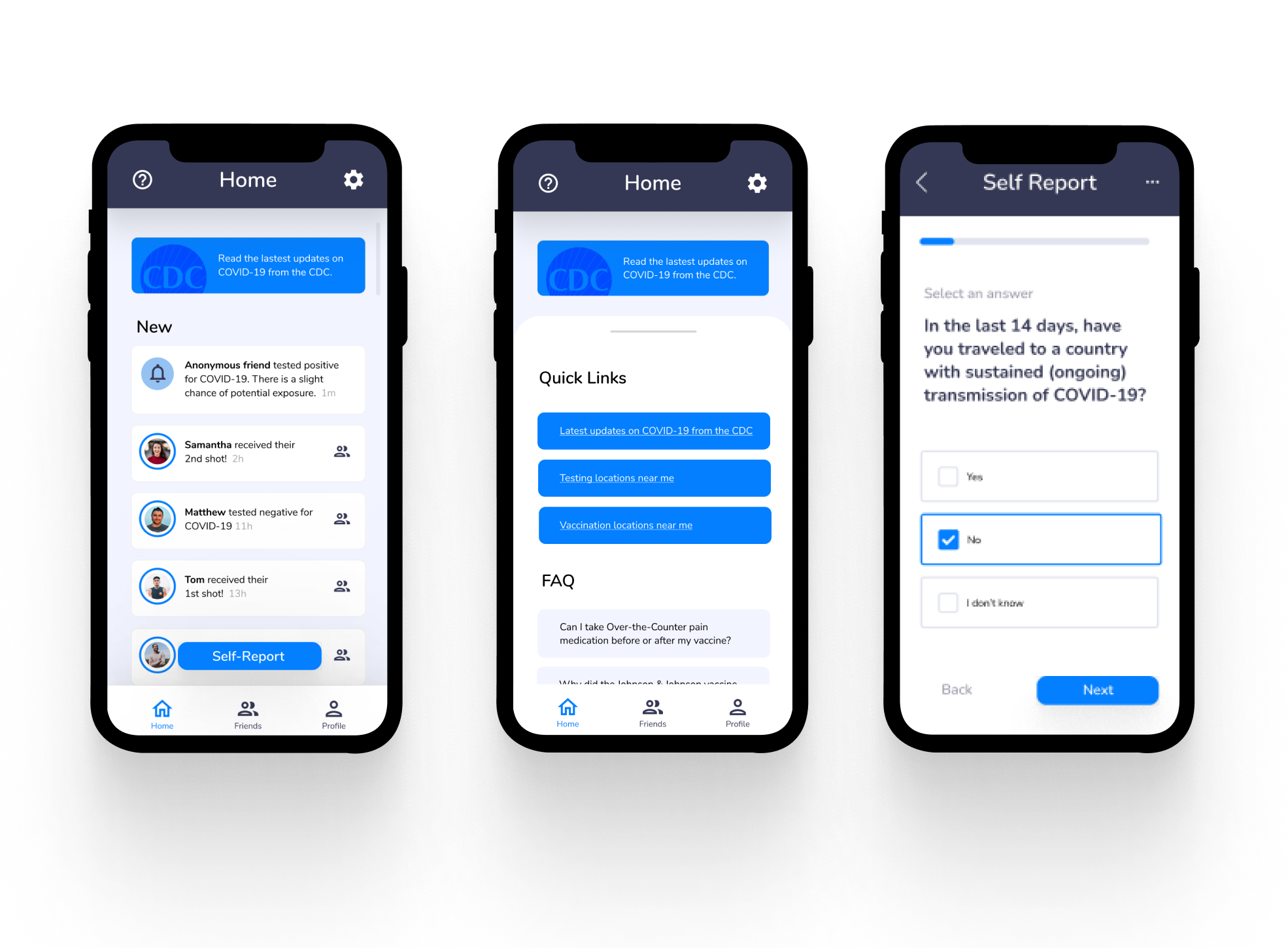
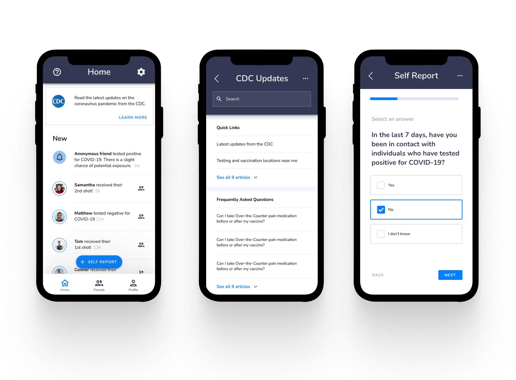
It's been over a year since we won the Designathon, and my design skills have improved. With the help of a mentor, I followed Google's Material Design System to redesign 3 key frames.
Before & After:
Reflection
IF I HAD EXTRA TIME, I WOULD -
- Address all the judges’ feedback, particularly the inclusion of an onboarding process. A simple name change to “Testifi” from “Vac-check” is what I’ve done for now, as one of the judges noted that “Vac-check” gives the misleading impression that the app only addresses vaccine verification. Renaming the app to “Testifi” denotes a more representative message.
- Investigate how to launch this app. With our current health climate, this app concept still seems to be relevant (e.g. Omicron variant, booster shots, reduced vaccine efficacy)
WHY WE WON - Two days is not a lot of time to design a prototype, so we had to budget our time wisely. We think that what set ourselves apart from the other teams is that while they focused on UI, we focused most of our attention to really understanding the problem at hand.
WHAT I LEARNED - Designing a good social product is tricky. Had Devanshi’s roommate not mentioned something about vaccine passport discrimination, we would have likely plowed forward and designed a problematic platform, despite our good intentions. Incorporating ethics is sometimes a headache, but all the good apps do so.